Photo Challenge : Compositional Balance
7th Jul 2017
Are you a passionate amateur photographer who feels as though a part of them is missing if they have nothing to take a photo with?
Do you like reading photography tips, but get fed up when all the photography tips you read are for DSLRs?
Yes? Me too! I’m Wendy, the Marketing Administrator and I’m going to be attempting to improve my photography, using the tutorials that my colleague Ruth publishes on the Education page.
I don’t have a DSLR! I would love to have one, but the quality of the images that can be taken on a mobile phone camera have improved so much in the last few years, that for me, it’s no longer an issue. A mobile phone is so much easier to carry around and it has built-in editing options, which I hope to learn how to use!
We have decided to call this section, ‘Photo Challenge’ and we hope that all you passionate amateurs will join me in my learning process, and maybe pick up a few handy tips yourselves.
So, I shall be going out and about with my mobile phone camera, and will be sharing with you, the ‘before and after’ images that I have managed to take, firstly, before reading Ruth’s tutorial tips and secondly, after reading her tutorial and then attempting to apply my new knowledge!
My first challenge is : Compositional Balance.
For this challenge, I had a look through the hundreds of photos I had on my camera and I tried to find the most ‘balanced’ image I had taken! In hindsight, I should have looked for the least balanced image, so that the improvement would be huge!
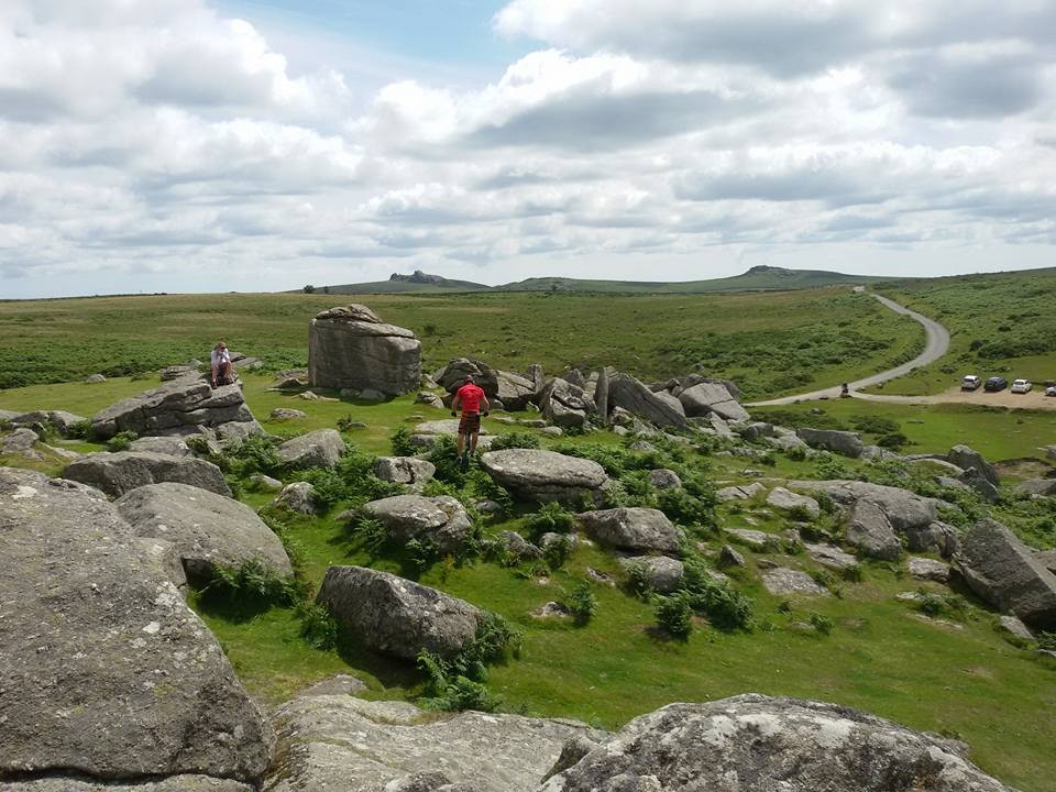
I decided on this image that I took on Dartmoor sometime last year, of a cyclist practicing his tricks on his bike. He was balancing on one wheel and jumping from rock to rock – it was fascinating to watch!

I thought this photo was balanced because the rock formation leads the eye from the bottom of the image to the centre, from there the eye is attracted to the hills in the background. The rule of thirds has been utilised to give balance to the composition (two-thirds of the image is the ground, one-third is sky). The cyclist wearing red draws the eye to the centre of the image, adding to the flow of the eye from the bottom of the image, through the centre, to the hills and sky in the background.
Over to Ruth, for a bullet-point critical analysis, while I read her tutorial on compositional balance:
- Colours: I love your use of contrasting colours, the small flash of a vibrant red colour juxtaposed against the green works to create dynamic within the image.
- Space: Open spaces are great and can be balanced on one side with a primary subject on the other side of the image.
- Eye direction: Your eye can be led to a certain point in a picture by using elements like triangles or arrows or something as simple as the direction that people in a picture are looking.
Thanks Ruth! Ok, so there is much more to compositional balance than I thought! If you’d like to read Ruth’s hints and tips, click here.
Symmetrical balance I understand – I took this photograph in Lisbon a few years ago, and even at the time, the OCD in me was jumping up and down with excitement at the symmetry I was able to capture!

The buildings either side of the park area, the lamps, even the hills in the background are almost a mirror image.
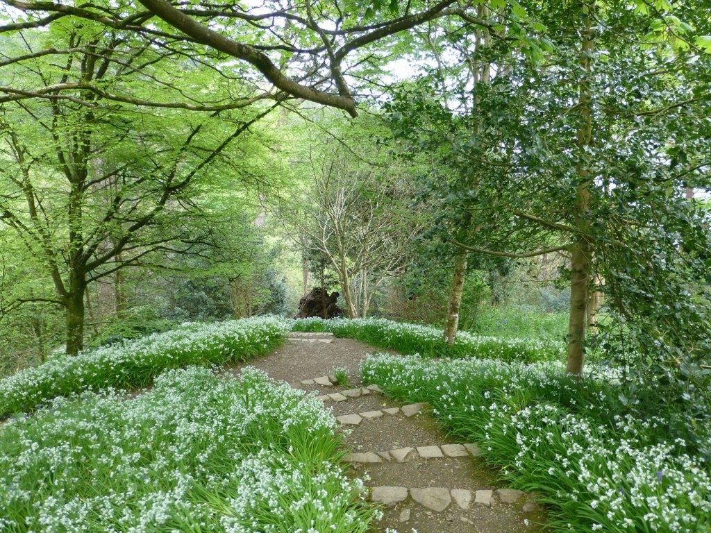
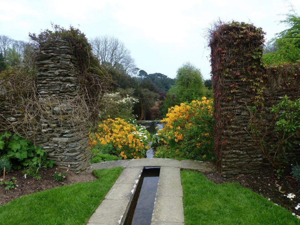
A local National Trust garden provides a couple more examples of symmetry that put a big grin on my face.


Maybe it’s a sign of my age, but I love to explore these places, camera in hand – a stunning view or exotic plant around every corner.
Asymmetrical balance has taken some doing, especially for a person who loves symmetry!
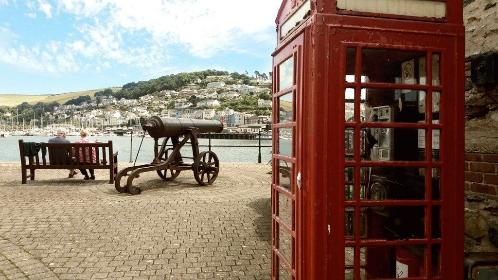
So, after reading Ruth’s hints and tips and studying her examples of asymmetric compositional balance, I took my phone out and about to look for something along those lines. I looked for something that would work as a large object in the foreground and be ‘balanced’ by preferably more than one feature in the background.
From all my attempts, this is the photo that I think is the best example of asymmetric balance.

The phone box in the foreground is balanced by the canon and the bench in the background, however, the objects are not symmetrical. There are aspects of the photo that provide interest, such as the pattern of bricks on the paved area and the land across the other side of the river with colourful buildings and so on.
Over to you Ruth…
Asymmetry can be one of the most impactful concepts in your compositional toolkit. I really like that you can see development and improvement within your compositions, it is an attention-grabbing technique that is interesting and thought-provoking.
- The image is arranged with the positive elements and negative space in such a way that no one area of the image overpowers the other areas.
- Colour balance: The smaller area of vibrant colour is offset by the larger area of more neutral colour.
Some great points for development there. Photography is fascinating – the use of colour and negative space are two elements I would really like to study further – maybe in another Photo Challenge!
I have loved taking on this first Photo Challenge looking at Compositional Balance. There is so much more to the idea of ‘balance’ in a photograph than I thought, so, with all those elements in mind, I shall be able to spot a potential photo that has symmetrical balance and asymmetrical balance – although the latter may take a bit more practice!
To read Ruth’s tutorial on Compositional Balance, please click here.