Essential Tips: Compositional Balance
14th Jun 2017
Balance is a compositional technique that perhaps isn’t as specific as other compositional ‘rules’ such as the rule of thirds; whereby subjects are aligned with guide lines and their intersecting points to create dynamic within a photograph. Balance refers to the ways in which the elements (lines, shapes, colours, textures, etc.) of an image are arranged. When different parts of a photo command your attention equally, perfect balance images can be achieved.
SYMMETRICAL BALANCE
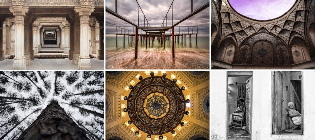
Symmetrical balance is achieved by arranging elements equally weighted on either side of the centre line of an image. The photo is perfectly balanced, and the graphic design you end up with is usually very pleasing. Architectural details often provide great example of symmetry, doors, windows, archways, skyscrapers, ancient ruins, and ceiling patterns.

Image credits (from left to right): © Bhambhaney Bharat, Adalaj Stepwell. © Yevhen Samuchenko, To the Deep. © Faramarz Zareian, Kashan. © Zach Callahan, Evergreens. © Ashraf Amer, Ornaments Details. © Manu de Caluwe, For 2 Cigarettes Less.
ASYMMETRICAL BALANCE
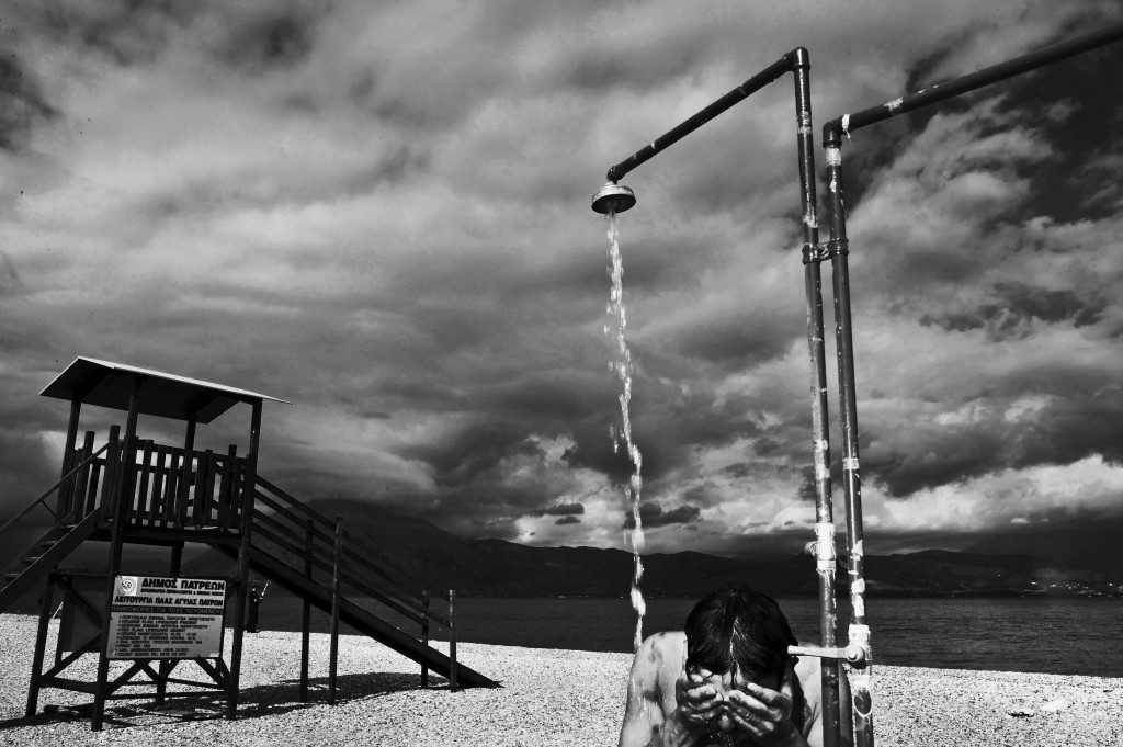
An image however does not have to be symmetrical to be balanced. Take this image by Simone Perolari for example, the subject showering on the right-hand side of the image is the main point of focus of the image, but the lifeguard tower on the left draws the eye just as much.I had so much energy that I could do anything. At that, I always drink a cup of tea with mint and melissa and sleep like a baby. The cialis generic pills are cool!

© Simone Perolari, Afghan Boy in Patras takes a shower after a swim in the sea.
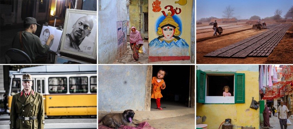
Here are some more fantastic example of asymmetric balance:
 Image credits (from left to right): © Pratip Biswas, Street Artist. © Ychinmoy Biswas, Way by Goddess. © Mario Gustavo Fiorucci, Making Bricks. © Georgios Zampas, The Soldier. © Ty Oneil, Vietnam the North. © Abdelrahman Abdelazeem, Ground Floor.
Next time your out with your camera here are a few different elements you could consider when thinking about creating balance within your images:
1. Areas of contrast
2. Areas of colour and saturation
3. Elements that are in focus (and out of focus!)
4. Postioning of people and/or subjects with the frame
5. The direction your subject(s) are looking
6. Balancing large elements with smaller ones